INTRODUCTION
With the introduction of Process 4 by Technicolour in 1932, the use of colour has become increasingly commonplace in motion pictures and animated films. Movies produced in black-and-white or monochrome without premeditated stylistic purposes are rarely found. While the absence of colour is undoubtedly marked, it is evident that the use of colour has grown highly sophisticated and be imbued with salience. This is largely because colours are laden with meanings that can be conveyed through their implementation in film. Colour today presents a myriad of artistic opportunities that directors can exploit to enhance cinematic narratives.
Given these possibilities with regard to the use of colour, we explore a selection of five of these aspects here:
1. Colour as a device through which certain themes can be conveyed.
2. Colour as a device to enhance characterization.
3. Colour can be manipulated in order to set mood and evoke audience emotion.
4. Colour used as a transitional device to demarcate time or space.
5. Colour can be evocative of certain genres.
The scope of our analysis further necessitates an examination of these uses in actual film narratives to demonstrate the different aspects of colour theory we seek to present. The films we have chosen are listed below in order of examination:
1. The Lord of The Rings Trilogy
2. Hero
3. Pleasantville
4. Schindler’s List
5. The Lorax (animation)
6. Phantom of The Opera
7. Dead Again
8. The Wizard of Oz
9. Memento
While movies like Hero, Pleasantville, The Wizard of Oz and Memento have already been quite exhaustively examined in existing literature on colour in film, we included them as hallmark examples that have contributed significantly to our current understanding of colour theory in cinematic narratives. However, this report will focus on other less-discussed movies, such as those within the Lord of The Rings Trilogy, in order to provide a more in-depth and detailed analysis that can be applied beyond the traditional scope of past studies.
DISCUSSION
Colour to convey themes
First, we examined the use of colour to convey major themes within a film narrative. The symbolism and association of a colour with a concept allows that concept to be magnified or diminished in a film through the manipulation of the colour in question, as seen in Hero. Hero consists of four segments which are colour-coded by four colours – red, green, blue and white. According to Zhang Yi Mou, each colour represents a different period and different (way of telling the) story. These colours trigger schemas that evoke certain emotions and concepts associated to them, subtly orientating the audience to the themes being represented in each segment. For instance, red is often used to index intense emotions such as danger and love, and is thus used to represent the themes of anger, lust, betrayal and bloodshed in the first segment. In contrast, blue, being a cool colour, brings out the qualities of peace and unity in the second segment.
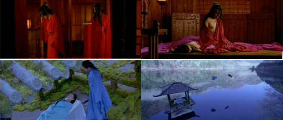
With certain film narratives, it was not the selection of colour itself that helped to convey a theme, but the presence or absence of colour that became meaningful for the narrative-internal storyline. For this, we looked at Pleasantville, in which the presence of colour in an otherwise monochrome world becomes symbolic of deviation from the expected norm, as well as Schindler’s List, which we felt provided an excellent example of both the interplay between presence and absence of colour as well as choice of colour to convey a thematic concern in the film narrative. Set during the Holocaust of World War 2, the film was predominantly shot in monochrome (although towards the ending, colour was introduced to mark a transition from the past to present-day time – another aspect of colour which we will discuss later in this report). However, in the scene where Schindler witnesses the liquidation of the Krakow Ghetto, the red of a young girl’s coat becomes the only instance of colour in the monochrome sequences. Not only does the red draw our attention to the solitary figure of the girl, it also becomes a focal point that highlights the violence and bloodshed happening around her as she walks through the massacre. Later, the red coat also unmistakably identifies the girl’s body when Schindler (and the audience, by extension) sees corpses being carted off in a wagon. This use of colour was a deliberate choice by director Steven Spielberg, who wanted to visually represent the blood on the hands of the Allies for not doing anything to stop the Holocaust despite knowing what was happening to the Jews.
Colour to enhance characterisation
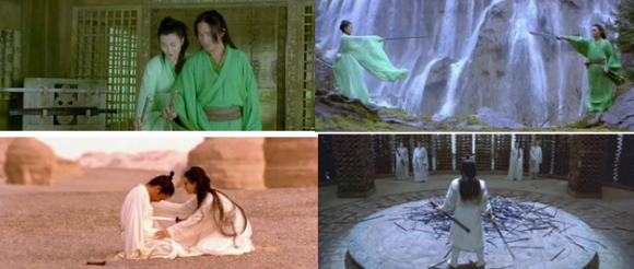
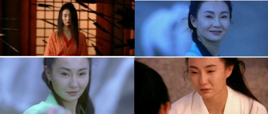
Next, we looked at the use of colour to enhance characterisation. “An external physical state can tell us about the psychological state of of the person” (Talib, 2011). In this sense, colours – a physical feature – that are predominantly associated with a particular character, for example in terms of costume colours or colours that dominate the palette when the character appears, can tell stories about that character’s personality or even psychological state. Flying Snow from Hero embodies this significantly, her personality changing in tune with the themes associated with the colour scheme featured in each segment. For instance, the red segment emphasizes her anger and hatred, while in the green segment, she exhibits spunk and youthful brashness, tying in with the segment’s theme of youth.
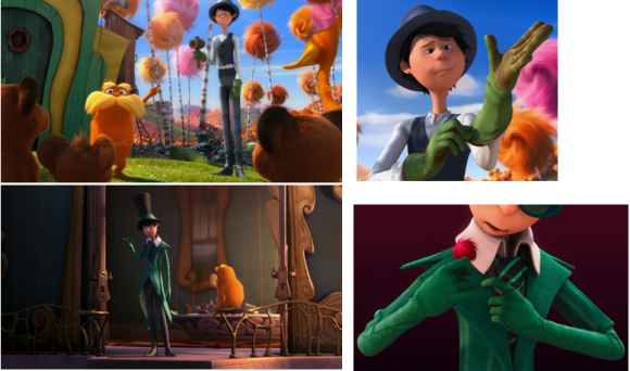
Notably, colour symbolism is not necessarily universal – in many ways, it is culture-specific. Similarly, the associations between colours and characters in cinematic narratives need not rest on conventional meanings behind those colours. Rather, meanings behind colours can be very specific to the film they are used in. Furthermore, colours can also signal character development by drawing our attention to changes in the character visually. For example, the character of the Once-ler in The Lorax starts out as a young entrepreneur who arrives in an unspoiled valley and harvests material from its trees to make his products. Although the colour scheme for his wardrobe is mainly blue, he dons a pair of green gardening gloves when he works. The colour green then takes on greater significance later in the film when, giddy with the success of his business, the Once-ler succumbs to greed and destroys the land’s entire ecosystem in his pursuit of wealth. Green becomes the dominant colour in his wardrobe, but it is a much darker shade of green than his working gloves, more reminiscent of money than of nature. Where green may have initially represented the Once-ler’s young and fresh entrepreneuring spirit, it eventually comes to represent his greed and extravagance. The significance of the colour green in The Lorax, a film with an environmentalist message, thus provides an example of how colour can be used to enhance characterisation and character development by invoking and subverting various colour associations within a narrative.
Colour to set mood and evoke audience emotions
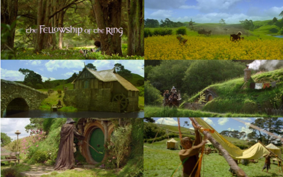
We also investigated the manipulation of colour in order to construct certain moods within scenes in the film narrative, thus also evoking emotional responses and eliciting ‘visceral response’ (Bellatoni, 2005) from the audience. This facet of colour function may not be as immediately evident to the audience eye as the previous usages of colour, as the manipulation of colour hue can be incredibly subtle. In order to be able to closely study such subtle colour shifts, we chose to conduct a case study on the Lord of the Rings trilogy, examining how the progression of the plot and the transition of colour vibrancy move in tandem.
For example, the construction of a vibrant and innocent mood at the beginning of the first film was mirrored through the use of saturated, almost cartoon-like colours, as seen in the Shire:
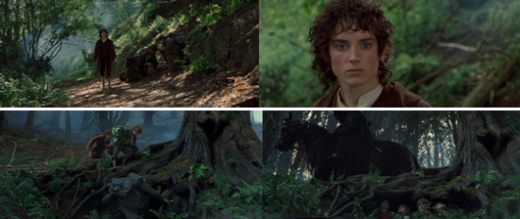
As the storyline progresses, however, the evil that permeates the land is reflected in the infiltration of dull and non-contrastive colours, as well as a desaturation of colours over landscapes and characters’ skintones:

Our analysis also took an in-depth approach to specific scenes; the transition of mood in these scenes was seen to be aided not only by aural stimuli, but also by diffusion of colour saturation and the transition from warm hues to cool. For instance, in scenes where Black Riders appeared, the shifting of mood from safe to sinister worked in tandem with the changing of hues; warm shades of green and brown were replaced by cool shades of blueish-green and grey:
Colour to mark transition
Colours can function as transitional device to demarcate shifts in time or space. This has been accomplished by alternating between coloured and monochrome sequences, or by switching to an obviously different colour style to mark the transition.
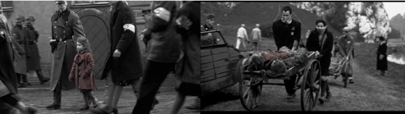
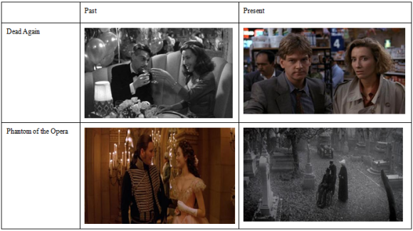
In films where colour is used as a device to delineate time, the focal point is usually on the present where the dominant narrative takes place. The past is presented in the form of flashbacks, and typically in monochrome or sepia, as a backstory that takes the primary narrative back in time hence forming a secondary narrative. This is depicted in Dead Again, where monochrome sequences denote the past while colour signals the present. However, the reverse is employed in Phantom of the Opera, wherecolour signals the past (in the form of flashback) while monochrome sequences signal the present. This could be because the primary focus of the narrative is on events that happened in the past rather than the present. The transition from monochrome to colour (and vice-versa) demarcates different timelines within the film and helps viewers along in making sense of the discoursal time of the film narrative.
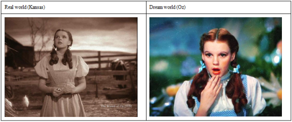
Colour can also mark transitions between two separate spaces. For instance, in The Wizard of Oz, Kansas is shown in black and white sequences (reality) while Oz (the dream world) is presented in colour.
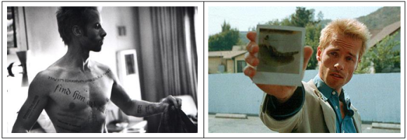
Finally, colour is used to delineate different narrative plot-lines that hold equal weight. In Memento, the narrative structure is nonlinear with two different plot-lines unfolding. Colour is used to mark events happening in reverse-chronological order and conversely, monochrome sequences signal sequential events dealing with the protagonist’s amnesia until the two plot-lines meet at the end. This consistent alternation between coloured and non-coloured sequences enhances the film narrative by creating suspense and confusion.
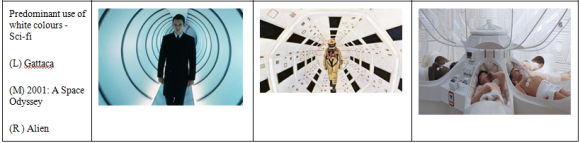
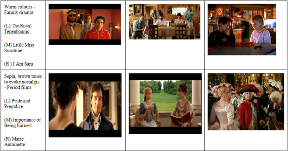
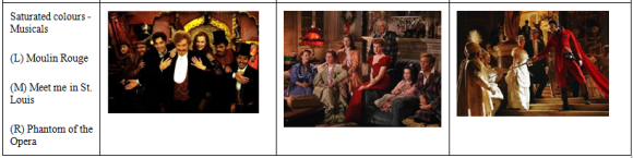
Colour as indicative of genre
Since film-genres can be differentiated through their visual styles, therefore, colours as an important visual element can be a defining characteristic of genres (in addition to others such as iconography, narrative, etc). As mentioned, colours can enhance mood and tone (elements that contribute to the visual style of films), thus certain colours can be said to be associated with certain genres. However, our group felt that this observation, while valid to an extent, might be too general and contentious and cannot be applied to films across the board. Therefore, this observation is applicable only at a generic level, especially since genres are relatively unstable groupings that are “not immutable and unchangeable” (Talib, 2011). Genres can be further differentiated into sub-genres and/or hybridized genres. For instance, within the fantasy genre, we have fairytales, science-fantasy (or science-fiction), historical-fantasy, dark-fantasy (elements of horror). Similarly, the horror genre encompasses slasher films, psychological-horror, science-fiction horror, zombie films, etc. As such, the boundaries between genres are less distinct than we think.
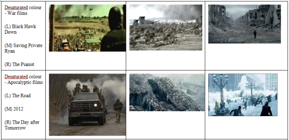
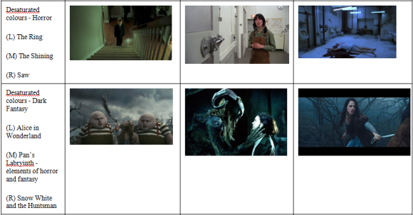
Muted and desaturated colours (such as grey, blue and green), along with a limited colour spectrum, are associated with bleakness and grittiness and can be seen generally in war and apocalyptic films. They can also be applied to horror and dark fantasies. White and green are associated with science-fiction to bring out a clinical and futuristic tone. Warm colours are used in family films to evoke a sense of warmth while films bathed in a soft, sepia glow are defining of period films. Saturated colours are seen generally in musicals to enhance a sense of hyperrealism. Therefore, we see that colours convey a sense of temperature where saturated colours create a warmer feel while desaturated colours enhance a cooler feel.
The following screenshots were taken from a range of movies within different genres for illustration purpose:
CONCLUSION
Our analysis has observed that a chosen colour as well as its hue, tone and saturation can play significant roles in enhancing cinematic narratives. Colour is more than just aesthetic; it can be both a stylistic choice and a means of creating emotions or appealing to certain concepts.
Often, the use of colour to enhance a film narrative plays on the schemas that audiences possess. When we associate certain colours with certain emotions or concepts, we are inclined to experience or recall these when presented with such palettes within the film. As mentioned, our colour schemas can be experience-bound and culture-specific, and the predominant choices of colour used in film narratives today are likely to appeal to the dominant culture.
This study of colour will be relevant in other visual media, such as video games and advertisements. The vast potential that colour offers its creative users therefore is plenty and should not be overlooked.
References
Bellantoni, P. (2005). If It’s Purple, Someone’s Gonna Die: The Power of Color in Visual Storytelling. London: Taylor & Francis.
Talib, I. S. (2011). Narrative theory: A brief introduction. Retrieved from http://courses.nus.edu.sg/course/ellibst/narr-str.html
– Amanda, Bobbie Jen, Wan Yee, Shana, Sarah


